Wednesday, April 29, 2009

Dynamic Charts & Graphs in SharePoint (Part III) - Multiple Pie Charts


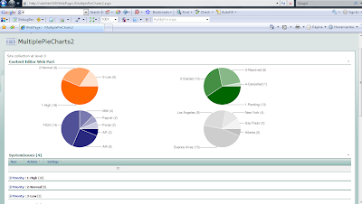
I finally got a script to get multiple Pie Charts on the same page!!!
In the screenshot, I show an hypothetical systems issues list, grouped by priority, status, system and site. You can represent different views of the same list or you can include multiple lists!!!

NOTE 1: avoid group by columns with "(" and ")" symbols as part of its name. Otherwise you should modify the code accordingly, because those are used to isolate the number of items within each group.

NOTE2: do not use this technique to represent sensitive data, as it travels through the Internet to the Google Charts service.

Here the process to implement:

1) Plan your page, that is, pre-define how many charts you will need (for some reason, if you add List View web parts AFTER you have inserted the script, new charts might not be rendered).

2) Create the Grouped views that you will need through the default List View, so you when you add the list views to the page, you can simply select the desired view from the drop down list.

3) Create a new web part page, add the List View web parts you previously defined, and arrange them (up to down, left to right) in the order you want the charts to appear.

4) Copy the script to your preferred editor and:

a) Configure the colors for your charts in the following code line:

chColor=new Array("FF6600","006600","000066","C0C0C0");

If you plan to use more than 4 charts, add more color codes with the same pattern.

b) If you want, change the size (in pixels) and type of chart ("p" or "p3") in the following portion of the URL for the charts:

...chart.apis.google.com/chart?cht=p&chco="+col+"&chs=500x150&chd=t:"+txt+"&chl="+txt1

For more information on how to customize the chart, see http://code.google.com/apis/chart/

c) Edit the path at the beginning of the script so it points to your jQuery library store.

5) Insert a CEWP (Content Editor Web Part) on the page, open the toolpane, then Source Editor and paste the script you have just configured. Thats it!

6) You can hide part or all the List Views so the page does not look "congested". To do so, open the tool pane of the List View web parts, go to "Layout" section and check "Hidden".

I hope you enjoy this!


<div id="jLoadMe" class="content"><strong></strong></div>


<script src="/jquery/jquery.js" type="text/javascript">

// To load jQuery (redefine the path if necessary)

</script>


<script type="text/javascript">

/*

* WORKING VERSION 1.0

* Multiple Pie Charts in SharePoint

* By Claudio Cabaleyro (2009)

*/


$("document").ready(function () {

chColor=new Array("FF6600","006600","000066","C0C0C0"); // add more colors if you include more than 4 ListView web parts

var ListViewArray = $('table.ms-listviewtable');

$(ListViewArray).each (function(j) {

var Grp = $(this).find ('td.ms-gb:contains(":")');


var coord= new Array();

var labels= new Array();

$.each(Grp, function(i,e) {

var MyIf= $(e).text();

var txt= MyIf.substring(MyIf.indexOf('(')+1,MyIf.length-1); // Extract the 'Y' coordinates

coord[i]=txt;

var txt1= MyIf.substring(MyIf.indexOf(':')+2,MyIf.indexOf("(")-1); // Extract the labels

labels[i]=txt1+"("+txt+")"; //add also coordinates for better read

});

var txt= coord.join(",");

var txt1= labels.join("|");

col= chColor[j];


// Adjust Chart Properties below - See Google Charts API for reference

var vinc= "<IMG src='http://chart.apis.google.com/chart?cht=p&chco="+col+"&chs=500x150&chd=t:"+txt+"&chl="+txt1+"'/>";

if (j%2 == 0)

;

else

vinc=vinc +"<br>";


$("#jLoadMe").append(vinc)

});

})();

</script>

Saturday, April 11, 2009

Dynamic Charts & Graphs in SharePoint (Part II)


SharePoint allows you to define list views that calculate Sum, Average, Min, Max, Standard Dev, etc. on the items, whenever your list has at least one numeric field or column.

The script below, combined with such a list view, will plot a Google Chart showing those totals dynamically. The chart scale is automatically adjusted with the maximum value to be charted so it fits the designated size in the script.

Once implemented, you can hide the list view web part so only the chart will render on the page. You can also play around with chart parameters within the script, to change chart type, style, size, colors or even build more complex charts. Take a look at the Google Chart API page for reference.

Hope this could be useful.

Here a step-by-step screen capture series:


<div id="jLoadMe" class="content"></div>


<script src="/jquery/jquery.js" type="text/javascript">

// To load jQuery (redefine the path if necessary)

</script>


<script type="text/javascript">

/*

* Google Chart for list column totals

* By Claudio Cabaleyro (2009)

*/


Array.prototype.max = function() { // function to get the maximum value of Y axis

var max = this[0];

var len = this.length;

for (var i = 1; i < len; i++) if (this[i] > max) max = this[i];

return max;

}


function BuildChartURL(Data, Names) // Adjust Chart Properties below - See Google Charts API for reference

{

MaxData= Math.round(1.1*Data.max()).toString();

var DataPoints= "&amp;chd=t:"+Data.join(",");

var DataTitles= "&amp;chl="+Names.join("|");

var ChType= "cht=bvs"; // Vertical bars type

var ChSize = "&amp;chs=300x200"; //HeighxWidth in px

var ChScale = "&amp;chds=0,"+MaxData; //Vertical scale: 0 through 10% over max series value

var ChLabels ="&amp;chm=N,000000,0,-1,11,-1";

return ("<p><IMG src='http://chart.apis.google.com/chart?"+ChType+ChSize+DataPoints+DataTitles+ChScale+ChLabels+"'/></p>");

}


var ArrayTitle= $('.ms-unselectedtitle:html'); //find all columns in titles row

var TitleTxt = new (Array);

$.each(ArrayTitle, function(i,e)

{

TitleTxt[i] = $(e).text(); // Store ALL column titles in TitleTxt

});


var ArrayTotal= $('.ms-vb2', $('#aggr')); //find all columns in totals row

var TotalTxt = new (Array);

$.each(ArrayTotal, function(i,e)

{

TotalTxt[i] = $(e).text().substr($(e).text().indexOf("= ")+2); // Store ALL column totals in TotalTxt

});


var Titles = new (Array);

var Totals = new (Array);

$.each(TitleTxt, function(i,e) // clear empty elements in totals row

{

if (TotalTxt[i] != "" && TotalTxt[i] != null)

{

Titles.push(TitleTxt[i]);

Totals.push(parseFloat(TotalTxt[i].replace(',','')));

}

});


$("#jLoadMe").append(BuildChartURL(Totals, Titles))

</script>

Friday, April 3, 2009

Dynamic Charts & Graphs in SharePoint


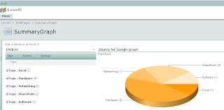
Inspired by the GREAT jQuery series by Paul Grenier at EndUserSharePoint and the TERRIFIC ideas of Christophe at Sparklines and other charts in SharePoint lists, I have built a small jQuery script and used Google Charts service to get the following (click to enlarge):


I based the example in a FAQ list, so the chart shows the distribution of questions among the different "Topics".

Being a little more general, the chart shows the statistical distribution of items from an underlying SharePoint list, being the groups defined by the meaning of the column chosen to "Group by" in the list view.


You can think of representing statuses of an issues list, completion percentages on a task list, and so on. You can even explore the use of calculated columns in innovative ways to define your groups... (I just thought about that!)


Solution

I will not present a detailed step-by-step approach here, you can drop me a note if you have doubts.

Recipe:

1) On the list you want to base your chart, create a "Group By" view.

2) Create a new web part page and insert the just created list view.

3) Insert a Content Editor Web Part and paste the code below (remember to use the Source Editor).

That's it!


NOTICE: if you are new to jQuery, you need to install it prior to use the code. You just need to upload it on a Document Library as explained here, Do not forget to adjust the path at the beginning of the code, to point to your library.

*** UPDATE: when you copy the code to your script editor, take a look at quotes (single and double) as they can cause a wrong script.


<div id="jLoadMe" class="content">PieChart</div>

<script src="/jquery/jquery.js" type="text/javascript">
// To load jQuery (redefine the path if necessary)
</script>

<script type="text/javascript">

var arrayList=$("td.ms-gb:contains(':')");
var coord= new Array();
var labels= new Array();
$.each(arrayList, function(i,e)
{
var MyIf= $(e).text();
var txt= MyIf.substring(MyIf.indexOf('(')+1,MyIf.length-1); // Extract the 'Y' coordinates
coord[i]=txt;
var txt1= MyIf.substring(MyIf.indexOf(':')+2,MyIf.indexOf("(")-1); // Extract the labels
labels[i]=txt1+"("+txt+")"; //add also coordinates for better read
});
var txt= coord.join(",");
var txt1= labels.join("|");

// Adjust Chart Properties below - See Google Charts API for reference
var vinc= "<IMG src='http://chart.apis.google.com/chart?cht=p3&chs=500x200&chd=t:"+txt+"&chl="+txt1+"'/>";
$("#jLoadMe").append("<p>"+vinc+"</p>")
</script>


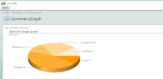
TIP I: you can hide the list view in your page so only the chart is rendered (click to enlarge):


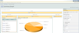
To do that, edit the page and look for the "Hidden" check box in the web part panel(click to enlarge):


TIP II: you can experiment changing the chart type, colors and size through the parameters in the URL by the end of the code. Check the Google Charts API documentation and have fun!!!